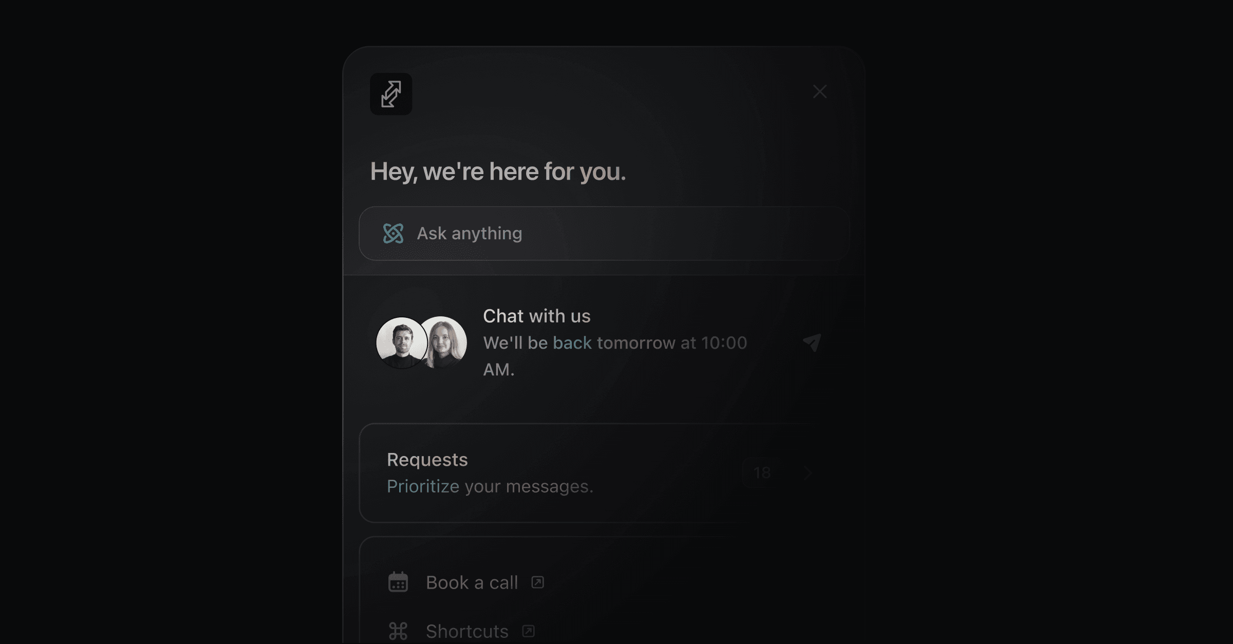
One widget brings your AI agent, live chat, docs, and changelog into your product. Install it with two script tags from Settings → Widget, then shape it with the options and methods below.
Copy the snippet from the widget settings page, where your widget key is already filled in, and paste it into your app. It looks like this:
<script>
  ;((w)=>{const P=(w.Productlane={queue:{}});["set","open","close","toggle","on","off","init","enable","disable"].forEach(m=>{P[m]=(n=>function(){P.queue[n]={args:arguments}})(m)})})(window);

  Productlane.init({
    widgetKey: "<your-widget-key />",
  })
</script>
<script
  async
  defer
  crossorigin="anonymous"
  src="https://widget.productlane.com/latest.productlane-widget.min.js"
></script>
The first script creates the global Productlane object and calls Productlane.init() with your widget key. The second loads the widget from Productlane's CDN.
widgetKey links the snippet to your workspace's widget settings. The <your-widget-key /> in the examples is a placeholder, not a JSX element. Replace the whole placeholder, angle brackets included, with your key.
Find your key on the widget settings page. It is a UUID:
Productlane.init({
  widgetKey: "<your-widget-key />",
})If Multiple Portals is on, pick the portal this page belongs to from the dropdown above the install snippet. Productlane adds a portalInstance field with that portal's slug, and the widget serves that portal's docs, changelog, roadmap, and requests instead of the Main portal's.
Productlane.init({
  widgetKey: "<your-widget-key />",
  portalInstance: "product-a",
})Pass the current user to identify them. The contact form then hides its email field.
Productlane.init({
  widgetKey: "<your-widget-key />",
  user: {
    email: "[email protected]",
  },
})Pass a signed JWT to verify who the user is, so their conversations link to them securely.
With identity verification on and a private portal, the widget refuses a message sent with only a user email and shows "authentication required". Pass a signed userToken as described below, or turn identity verification off in Settings → Widget.
Click Generate Signing Secret on the widget settings page. The secret starts with wg_sec_.
Sign with HS256, and include the user's email, an issued-at time (iat), and an expiry (exp). The expiry can be at most 1 hour after iat. It does not limit how long the user stays signed in: the widget exchanges the token for a session that lasts 12 hours.
const jwt = require("jsonwebtoken")

const secret = "wg_sec_..."

const payload = {
  email: user.email,
  iat: Math.floor(Date.now() / 1000),
  exp: Math.floor(Date.now() / 1000) + 15 * 60, // 15 minutes (recommended)
}

const userToken = jwt.sign(payload, secret, { algorithm: "HS256" })Pass it as userToken when you initialize, or set it later, for example after login:
Productlane.init({
  widgetKey: "<your-widget-key />",
  userToken: "<user-token>",
})

Productlane.set({ userToken: "<user-token>" })Productlane.signOut()When one person can switch between several customer accounts in your app, give each account its own widget history. Add the account to the token you sign.
orgExternalId: your id for the account (the tenant).
orgName: the account's name, shown on the company in Productlane.
const payload = {
  email: user.email,
  orgExternalId: tenant.id,
  orgName: tenant.name,
  iat: Math.floor(Date.now() / 1000),
  exp: Math.floor(Date.now() / 1000) + 15 * 60,
}
const userToken = jwt.sign(payload, secret, { algorithm: "HS256" })
Pass a new token after login and every time the user switches account:
Productlane.set({ userToken })The widget then starts a fresh chat for that account. The request list shows that account's requests only, even when the same person belongs to several accounts. Each account appears as a company in Productlane, created the first time a token names it.
On an account switch, call Productlane.set({ userToken }) alone. Calling signOut() at the same time can clear the new session.
Without identity verification
Anonymous visitors keep their chats in the browser, shared by every account on your domain. Call Productlane.signOut() when the user switches account to clear them.
userToken or user, not bothSetting the plain user object after a userToken, for example Productlane.set({ user: { email: ... } }), overwrites the verified session and signs the user out. Use userToken for signed-in users and user for simple identification.
A user signed in to the widget with a userToken is also signed in to your portal when they click a link that opens it, such as a roadmap item, a changelog entry, a docs article, or their requests.
The widget asks for a short-lived, one-time code when the user clicks a portal link.
The portal exchanges the code for a session.
Turn on Portal Authentication on the widget settings page. It appears once you have generated a signing secret.
Tell the AI agent which page or feature the user is looking at, so its answers fit what they are doing. Context is an object of string keys and values.
Productlane.setContext({
  page: "dashboard",
  feature: "analytics",
  plan: "pro",
})

Productlane.getContext() // { page: "dashboard", feature: "analytics", plan: "pro" }

Productlane.clearContext()
The context travels with every question the user asks. A user on your analytics dashboard who asks "How do I export this data?" gets an answer about analytics exports, not about the rest of your app.
The widget follows the visitor's system theme by default. Use mode to pin one scheme.
Productlane.init({
  widgetKey: "<your-widget-key />",
  mode: "dark",
})
Value | Behavior |
|---|---|
| Follows the visitor's system setting and switches live when it changes. This is the default. |
| Always renders the light theme. |
| Always renders the dark theme. |
If your site has its own theme toggle, pass the new value to Productlane.set(). The widget repaints without a reload.
Productlane.set({ mode: "light" })The light and dark accent colors live on the Theme page, linked from Settings → Widget → Theme settings. mode only picks which of the two applies.
The widget follows the visitor's browser language, as long as your workspace has that language turned on. To pick the language yourself, pass language to init. A language your workspace hasn't turned on is ignored, and the widget falls back to your default language.
Productlane.init({
  widgetKey: "<your-widget-key />",
  language: "nl",
})
To switch languages later, for example from a language picker in your app, call reload:
Productlane.reload({ language: "de" })position sets where the button sits: "left", "right" (the default), or "center". The panel opens beside the button, or centered for "center".
offset moves the widget away from the screen edges. bottom, left, and right each take a CSS length such as "20px" or "2rem", and all three are optional. Use left or right to match your position.
Productlane.init({
  widgetKey: "<your-widget-key />",
  position: "left",
  offset: {
    bottom: "80px",
    left: "16px",
  },
})To open the widget from your own button, hide the default one and call the JavaScript API.
In Settings → Widget, set the icon style to None.
Call Productlane.open() or Productlane.toggle() from your button's click handler.
<button onclick="Productlane.open()">Open support</button><button onClick={() => Productlane.toggle()}>Open support</button>To open a specific view, pass its name:
Productlane.open("AICHAT") // the AI agent
Productlane.open("FEEDBACK") // the contact form
The size of the built-in button cannot change. For a larger or differently styled trigger, use your own button.
Spotlight replaces the floating button with an input bar at the bottom of the page. The visitor types a question straight into it and the AI agent answers.
Productlane.init({
  widgetKey: "<your-widget-key />",
  spotlight: true,
  position: "center",
})
Any position works. "center" suits a landing page, and "right" keeps the bar where the button would have been.
At rest: a short pill whose placeholder cycles through your suggestions, one every five seconds.
On focus: the bar widens and shows up to three suggestions above it. Clicking one asks it.
On send: the bar grows into the chat panel at the same width, and the agent answers there. Files can be attached once the bar is open.
After closing: the bar reads "Continue conversation", and one click reopens the chat where it left off.
The suggestions come from Settings → AI → Productlane Agent.
A landing page has no signed-in user and no support page of its own, so a button in the corner is easy to miss. Spotlight puts the question box in front of the visitor instead, and the agent answers about pricing, integrations, or migration from your help center and changelog.
Pair it with Productlane.setContext() so the agent knows which page the visitor is reading. On a pricing page, "what happens after the trial" then gets an answer about your plans.
Spotlight turns on and off without a reload, so one site can show the button in the product and the bar on its marketing pages.
Productlane.set({ spotlight: true })

// Back to the button
Productlane.set({ spotlight: false })Spotlight reaches the AI agent only. Docs, the changelog, requests, and changelog popups stay behind the standard button.
While spotlight is on, Productlane.open() opens the agent, whatever view you pass.
The bar falls back to the standard button when the AI agent is off for the workspace, and inside an embedded widget, which sizes its own container.
On a phone the bar spans the screen width and the chat opens full screen.
Set disableChangelogNotification to true to hide the popup that appears when you publish a changelog, for example for selected users. The widget otherwise works as usual.
Productlane.init({
  widgetKey: "<your-widget-key />",
  disableChangelogNotification: true,
})Turn off Show branding in Settings → Widget to remove the Productlane branding. Removing branding needs the Scale plan.
Custom links open in a new tab. To run your own code instead, return false from a customLinkClicked handler and the widget skips opening the URL. Leave the URL blank in the widget settings for a link that only fires the event.
Productlane.on("customLinkClicked", (link) => {
  if (link.title === "Start tour") {
    startProductTour()
    return false
  }
})
link has the shape { title?: string; url?: string }. With no URL configured, link.url is undefined.
Call methods after the widget loads, inside a loaded handler:
Productlane.on("loaded", () => {
  Productlane.set({ user: { email: "[email protected]" } })
})
Productlane.open(view?) opens the widget, on the last active view by default. view can be "INDEX" (the home screen), "CHANGELOG", "DOCS", "FEEDBACK" (the contact form), "AICHAT" (the AI agent), "LIVE_CHAT", "ROADMAP", or "REQUESTS". Names are case-insensitive, and an unknown name opens the home screen.
Productlane.close() closes the widget.
Productlane.toggle() opens or closes it.
Productlane.disable() hides the widget on the page, and Productlane.enable() brings it back.
Productlane.openDocs(urlNameOrId) opens an article, by its URL path such as "get-started/quickstart" or by its id.
Productlane.set(options) updates any option you can pass to init().
Productlane.signOut() ends a verified session.
Productlane.setContext(), getContext(), and clearContext() manage page context.
Listen with Productlane.on(event, handler) and stop with Productlane.off(event, handler).
Event | Fires when |
|---|---|
| The widget has fully loaded |
| The widget opens |
| The widget closes |
| The widget toggles |
| A visitor clicks a custom link. The handler gets |
| A docs article opens. The handler gets |