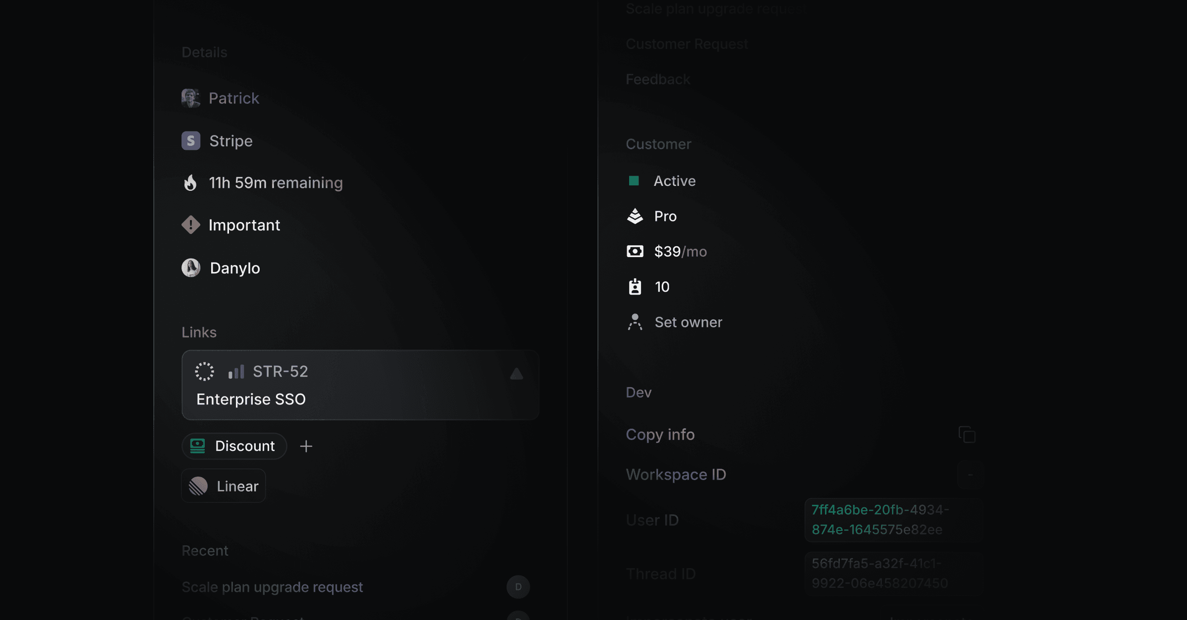
Connectors show live data from your own systems inside Productlane. An HTTP endpoint fills a sidebar section on a thread, contact, or company, and it can offer actions your team runs with one click. The Productlane Agent and the AI Assistant read the same data. They can also call the tools of an MCP server.
Go to Settings > Connectors. Connectors are on the Pro plan and higher.
Click Add and pick HTTP endpoint or MCP server. Enter a name, a URL, and a description. The AI reads the description to decide when to use the connector, so name the questions your customers ask. Add the headers your server needs, then click Test request or Test connection.
Tool call history, below the list, shows every tool call the agent made in the last 14 days.
Built-in properties | Connectors | |
|---|---|---|
Data | Stored in Productlane | Requested live from your system |
Editable in Productlane | Yes, in the sidebar or the API | No, your system owns it |
Filterable in views | Yes | No |
Source | Productlane, synced with Linear customers | Your HTTP endpoint or MCP server |
HTTP endpoint. Productlane sends a POST request that describes one customer. Your endpoint answers with components to render. It can also offer actions.
MCP server. Productlane connects over Streamable HTTP and lists the server's tools. The tools are for the AI only. Open the connector's tool list to set access per tool:
Agent: the Productlane Agent may call it. Every tool starts off.
Internal: the AI Assistant and AI drafts may call it. Every tool starts on.
Public knowledge: the Productlane Agent may use the server for visitors with an unverified email. Leave it off for a server that returns one customer's data.
The Agent column allows up to 100 tools per server. Productlane waits 10 seconds to connect and 30 seconds per request.
Productlane sends POST to your URL with Content-Type: application/json and every header you configured. Header values are encrypted at rest. A sidebar request times out after 15 seconds, an agent request after 8 seconds. Productlane rejects responses larger than 256 KB.
{
  "workspaceId": "0b7e6c1a-52f4-4d0e-9a51-3c2f8e1d7b90",
  "email": "[email protected]",
  "name": "Ada Lovelace",
  "companyId": "5f2e9d34-8a1b-4c67-b0e2-7d913a6c4f18",
  "companyName": "Acme",
  "companyDomains": ["acme.com"],
  "companyLinearCustomerId": null,
  "liveChatSessionId": null,
  "type": "read",
  "source": "sidebar",
  "identityVerified": true,
  "subject": {
    "email": "[email protected]",
    "name": "Ada Lovelace",
    "emailIsVerified": true,
    "contactId": "c7d1a2b3-9e84-4f5a-8c16-2b0d7e3f9a41",
    "companyId": "5f2e9d34-8a1b-4c67-b0e2-7d913a6c4f18",
    "companyName": "Acme",
    "companyDomains": ["acme.com"],
    "companyLinearCustomerId": null,
    "liveChatSessionId": null,
    "threadId": "9a4b8c2d-1e3f-4a5b-9c6d-7e8f0a1b2c3d"
  }
}
type is read, listActions, or executeAction.
source is sidebar or agent.
subject.threadId is null on contact and company pages.
On a company page, email and name are empty strings.
An executeAction request adds action, input, and idempotencyKey.
An endpoint that ignores type keeps working as a read-only connector.
Answer a read request with a 2xx status and this body:
{
  components: [/* up to 100 */],
  data: [{ ref: "plan", value: "Scale" }], // optional, up to 50
}
text shows a line of text. color is normal or muted. size is s, m, or l.
{ type: "text", text: "Scale plan", color: "normal", size: "m" }badge shows a colored label. color is green, gray, or red.
{ type: "badge", text: "Active", color: "green" }row puts a label on the left and a value on the right. Each side takes any component except row or divider.
{
  type: "row",
  left: [{ type: "text", text: "MRR", color: "muted", size: "s" }],
  right: [{ type: "text", text: "$2,400", color: "normal", size: "s" }],
}
spacer adds vertical space. size is xs, s, m, l, or xl.
{ type: "spacer", size: "m" }divider draws a line. spacing is xs, s, m, l, or xl.
{ type: "divider", spacing: "s" }linkButton opens url in a new tab. The URL must use http or https.
{ type: "linkButton", label: "Open in admin", url: "https://admin.acme.com/users/42" }copyButton is an icon that copies value. tooltip is optional.
{ type: "copyButton", value: "cus_Q8x2Lm", tooltip: "Copy Stripe ID" }copyField shows value in monospace and copies it on click. tooltip is optional.
{ type: "copyField", value: "usr_8f21c" }actionButton runs one of your actions with input. label has 1 to 60 characters. variant is default, outline, or negative. confirm opens a dialog first: title up to 80 characters, description up to 280, confirmText up to 30.
{
  type: "actionButton",
  label: "Extend trial",
  action: "extend_trial",
  input: { days: 14 },
  confirm: { title: "Extend the trial by 14 days?" },
}
Refs. Add ref to a text, badge, copyButton, or copyField to name its value. List hidden values in data: a string up to 2,048 characters, a number, or a boolean. A field rule on a connector tool can fill an argument from http.<ref>, so the model never writes it. A ref matches ^[a-zA-Z][a-zA-Z0-9_-]{0,63}$ and may appear once per response.
What the AI reads. The AI gets a plain-text copy of your components, cut at 4,000 characters. A row becomes label: value. Action buttons, spacers, and dividers are left out. data never reaches the AI.
Errors. The sidebar shows the status of a failed request, or the first three problems of an invalid body.
On a listActions request, return the actions this connector offers:
{
  actions: [
    {
      name: "extend_trial",
      title: "Extend trial",
      description: "Extend the customer's trial by a number of days.",
      inputSchema: {
        type: "object",
        properties: { days: { type: "number" } },
        required: ["days"],
      },
      requiresConfirmation: false,
    },
  ],
}
name matches ^[a-zA-Z0-9_-]{1,64}$.
description is required, up to 1,024 characters. title is optional, up to 60.
inputSchema is JSON Schema with an object root. It defaults to an empty object.
Up to 25 actions per connector.
Productlane caches this list for 5 minutes per connector, so return the same list for every customer. Saving the connector clears the cache.
On an executeAction request, run action with input and answer:
{ success: true, message: "Trial extended to 14 October.", components: [/* optional */] }message has up to 2,000 characters and shows as a toast. Returned components replace the section, otherwise it reloads. idempotencyKey stays the same for the same action, input, and record. Use it to drop duplicate runs.
Who runs actions:
Teammates click an actionButton. Viewers cannot. A run on a thread shows in its activity.
The AI Assistant can run every action.
The Productlane Agent runs actions without requiresConfirmation for a verified customer, once Productlane Agent access is on. It runs a call with the same input at most once per thread every 2 minutes. For requiresConfirmation: true, it tells the customer the team will run it.
AI drafts read data only.
Thread sidebar: each HTTP connector gets a collapsible section under Connectors, in the order of your settings list. Drag connectors there to reorder them.
Contact and company pages: the same sections, in a column on the right on wide screens.
Productlane Agent: in the widget, live chat, and automatic replies. An HTTP connector needs Productlane Agent access, on by default. An MCP server needs tools on in the Agent column.
AI Assistant and AI drafts: every connector. An HTTP connector needs a thread with a contact or company. Turning off Productlane Agent access does not change this, so your endpoint can still receive requests for AI drafts and the AI Assistant. These are internal features only, never public.
The URL must use https://.
Productlane follows no redirects. A 3xx response counts as an error.
Productlane refuses URLs that resolve to private, loopback, link-local, or cloud metadata addresses. It checks again at connect time, which stops DNS rebinding.
identityVerified is false when the contact typed their own email without proving it. The sidebar then shows a warning. The Productlane Agent skips your connectors, apart from MCP servers marked as public knowledge. Check the flag before you return private data or run an action.
Contact and company pages always send identityVerified: true, because a teammate opened a workspace record.
Test request sends your newest contact's real details to the URL.