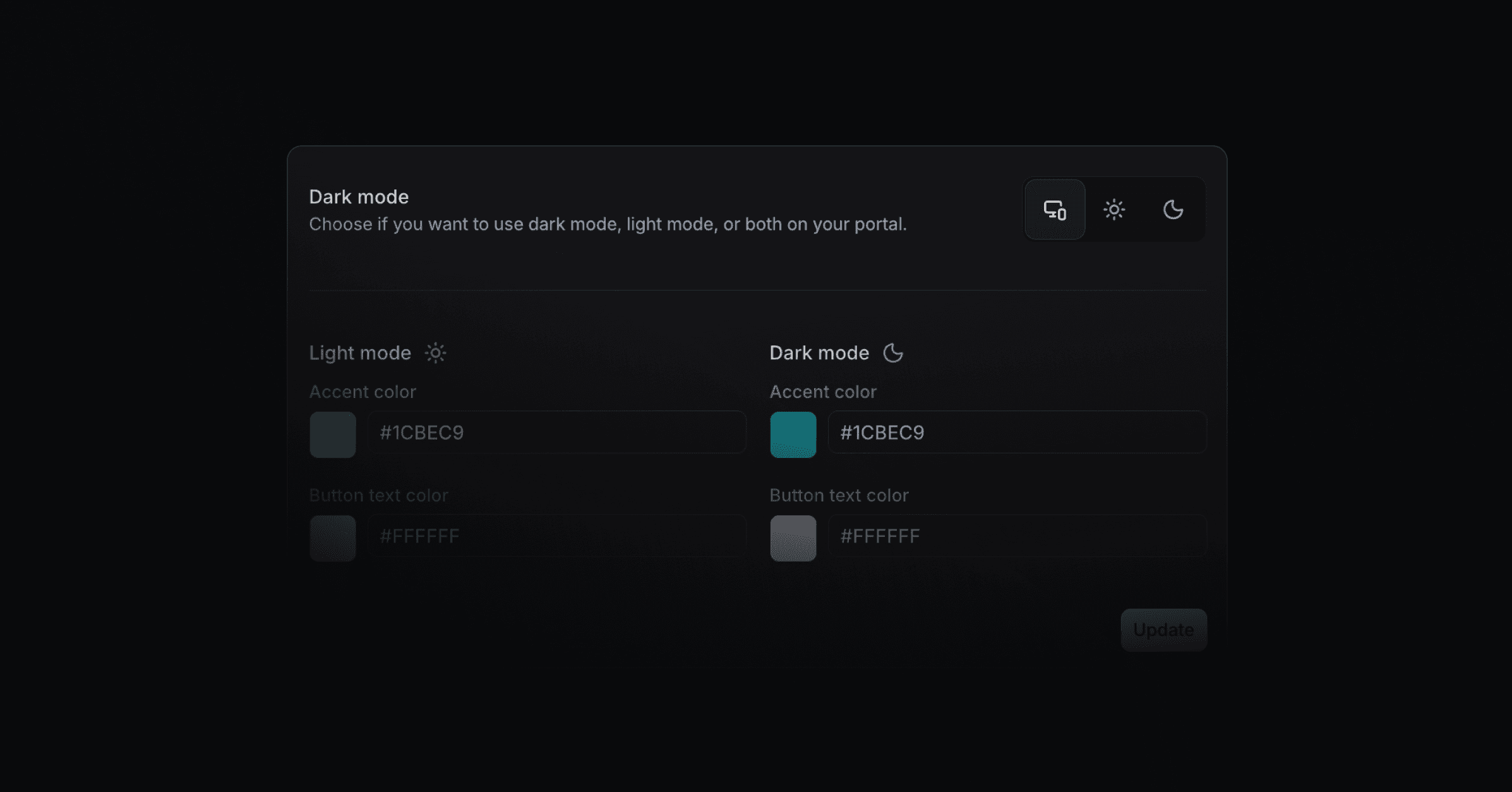
The theme controls how your portal and widget look: the image shown when someone shares a link, light and dark mode, and your accent and button text colors. A live preview sits beside the settings and updates as you go.
Settings > Portals > Theme. The Theme settings row on the widget page opens the same page.
Upload a 1200x630 embed image so shared links carry a branded preview.
Choose how the portal handles appearance: System follows the visitor's own preference, or pin it to Light mode only or Dark mode only.
Set the light mode Accent color and Button text color, by typing a hex value or picking from the swatch.
Set the dark mode pair the same way.
Watch the preview to check both modes read well.
Everything here saves on its own. Color fields save shortly after you stop typing or adjusting.
Set the dark mode selector to Light mode only. It applies to every visitor, since the setting belongs to the workspace rather than to each person.
Your portal and your widget share one theme, so a change here applies to both.
Background colors are fixed for each mode so text stays readable. Your brand color comes through the accent color, which you set separately for light and dark mode.
The embed image has to be exactly 1200x630 pixels.
Set your logo here, above the embed image, or on the General settings page. Both save the same workspace logo, shown in the portal header, the widget, and your emails.
Viewers can see the theme but cannot change it.
This setting covers the portal and widget only. The Productlane dashboard, inbox included, follows your device's light or dark setting.